What Emotion Does Your Brand Colour Evoke?
“I found I could say things with colour and shapes that I couldn’t say any other way – things I had no words for.” – Georgia O’Keeffe
Colours aren’t plain, bland, inanimate concepts. They are in fact alive and are a powerful means of communication as they effectively stir emotion and hold deeper meanings. That is why a huge chunk of the essential elements of branding is attributed to colour. Just like how our words could either be a bulldozer that breaks a house or a brick that builds it, your brand colours could also either build or break your brand.
Hence, understanding what message and emotion your brand colours convey is definitely crucial. To save you from the hassle of finding what emotion your brand stirs, here’s a quick list of the common brand colours and their equivalent meaning:
Orange
Generally energetic, refreshing and sparks creativity. This colour is perfect for a brand that wants to portray itself as fun, playful, exuberant and vital. It is also often associated with being adventurous, and cheerful. Other brands, however, bank on the concept of it being a colour that radiates warmth, or a colour that stimulates appetite being representative of citrus fruits and other vegetables stirring hunger and thirst.
Blue
This colour denotes peace, serenity and calmness. Being the shade of the sky, oceans and crystal clear seas, blue generally stirs the feelings of tranquillity, putting people at ease and making the brand seemingly trustworthy, dependable, responsible and secure. The sense of security may also be the result of “blue” perceived as “clean”, thus, its usage in many hygienic brands as well.
Yellow
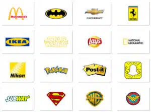
As reminiscent of the sun, this colour upheaves feelings of hope, optimism, energy and happiness enveloped in joy, playfulness, and friendliness. Because of its brightness, brands using such colour naturally catches the eye. It is popular for food-related brands and household products but not so for the clothing industry.
Red
The colour of urgency, passion, danger and excitement. Brands using this colour often wants to emphasize on its thrilling, unpredictable feature. When the goal is to grab attention and be aggressive and provocative, marketers often opt for this colour option.
Brown
Often associated with nature, this colour evokes simplicity and honesty. Brands using this colour embark on strength and good quality or durability, while for food- something chocolatey.
Green
Generally associated with nature and money. This colour spurs positive thoughts of growth, generosity, fertility and health.
Pink
Peace, compassion, and love is the overall emotion evoke by this colour. However, in the marketing world, this has also been so heavily used for female audience, in the sense of its femininity, playfulness and unconditional love.
Purple
Exudes royalty, elegance, wisdom, power and nobility. Because of its luxurious approach, this colour must be used in caution as too much of it may unintentionally evoke an unwanted sense of arrogance.
Black
White
So, does your current brand colour evoke the right emotion you want it to?

